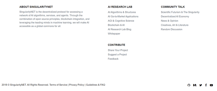
In the footer of the website I see text “2018 © SingularityNET. All Rights Reserved.” and links “Terms of Service”, “Privacy Policy”, “Guidelines & FAQ” right next to it but this text and links are written very close to each other and there are no indicators (while we don’t hover the cursor on the links) that they are links actually.
@ibby just wanted to pay special attention to this topic before forum launch, you have done wonderful header of the website (with SNET name, icon and so on) so maybe it would be also a good idea to make some panel in footer of the website (bottom part of webpage) plus separate “2018 © SingularityNET. All Rights Reserved.” and “Terms of Service”, “Privacy Policy”, “Guidelines & FAQ” in it somehow? Panel in footer is more optional point here, just an idea for consideration. Also it looks like that the whole part on the screenshot below is a constant footer so maybe it’s all can be made like one panel with some common background color.
Thank you for the feedback! I adjusted it to match better with the style elements used on the homepage, so I used the dots now for the background in the footer part, and the gradient in the copyright part. I hope you like it! 
You are welcome  Yeah, footer is much better now!
  I only wonder all this time if we can and should separate static text “2018 © SingularityNET. All Rights Reserved.” and links “Terms of Service | Privacy Policy | Code of Conduct” in the footer but I am not sure how to make it better, don’t want to spoil the look of it.
Hmmm… I have an idea. Maybe we put the links left and the copyright in the middle.
Yeah, I thought about it, just want to choose the best variant, can you show how it will look like? Or just make and then watch to decide which variant is better 
Maybe remove the links in that bar and perhaps place them somewhere in the dotdotdot area.
Good idea, I guess it can be the best solution. It embarasses me everytime I see it, this copyright and links together in the footer. For example, the website which I test on my job has two footers, one above containing links with more pale colors and one under it with darker colors and copyright. But I am not sure that two footers will look good for this forum so maybe your idea about removing the links to different section will be optimal 
When you click on the hamburger menu, you also see about + code of conduct. I am tempted to keep it minimal and stick to those links to those pages right now, and not to mention them in the footer somewhere. I think people read them (or not) when they register, and afterwards they don’t look at it again. So I am tempted to not waste space to those links as people can also find them by going to about in the menu and then you can find all of it. What do you think?
Hmm, it makes sense. Terms of Service are now mandatory to be checked before registering, right?
Yes :D… hmm I am going to add another block with general anyway in the bottom right, privacy policy, terms of service, code of conduct, + Q&A category.
I think it is a lot better now  ! Thank you for your help.
You are welcome  I also think that now it looks better)


