Maybe its just my Display mode.
|| subjective User Experience.
I would enjoy a greater color difference between read and unread articles.
And also switching colors in grayscales mode for the background.
So that it is possible to switch the site to a dark background.
And light color text. and vice versa
Thank you for your feedback! I will create a new topic here and assign you ownership of it in the feature requests category regarding the dark mode . Please use 1 topic per feature request, bug, or feedback point. This allows me to easier manage various requests.
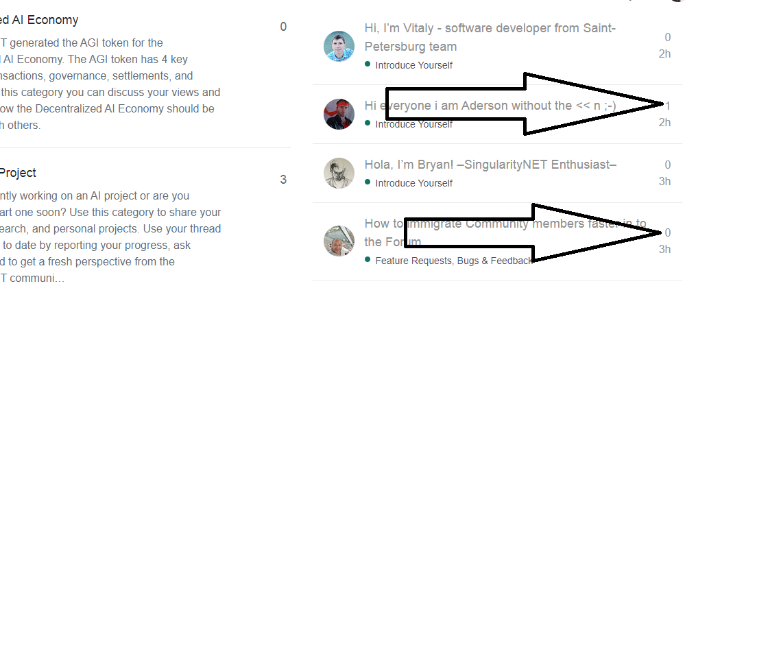
I think you read both categories? The arrow points to number of reactions Could you please check again if there is a clear difference in contrast and to make sure there is not a bug? Unread topics should clearly be in black letters, not greyed out and also have a notification sign next to it
It has either “new” when unread or a circle with a number if you read it already but there were new comments.