
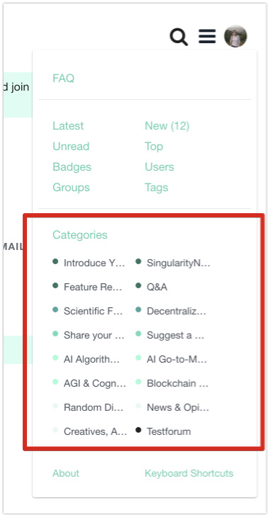
I see only first word of category name. Maybe it would be better to change elements and show them in one column collapsing names under “Category”.
example implementation Screencast
I see only first word of category name. Maybe it would be better to change elements and show them in one column collapsing names under “Category”.
example implementation Screencast
Blockquote
I see only first word of category name. Maybe it would be better to change elements and show them in one column collapsing names under “Category”.
I experienced similar issue, got used to it a little bit.
But if it could scale bigger for a faster access to this list.
With all categories displayed ![]()
That could enhance it, in my opinion.
I have been trying out some options but both are not ideal. We could have them in 1 column, but then the list gets very long. Alternatively we could maybe go for shorter category names… other options are making it more narrow/condensed. Same goes for the dropdown in the top left. I will think about this design setup and change it asap.