
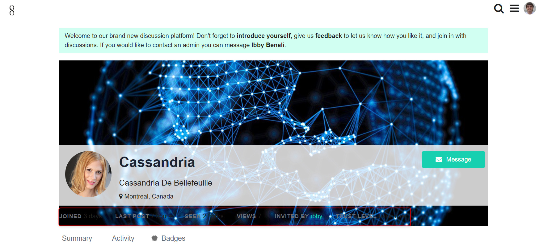
Maybe it can be a good idea to investigate the possibility of implementation the management of fonts in user info or something else to make the display of info better. Right now some info can be almost unreadable because of background picture. Here is an example
2 Likes
Solved! I am doubting about whether I should make the transparent part opaque too. What do you think? I like it more when opaque I think… it makes it more clear.

Maybe it will be easier to say my opinion if I will see exactly how it would look like. Because just imagining that I have doubts what solution is best. Is it time consuming to show the example?

Something like this - but then the same color probably (just noticed I did the wrong one here in the example :P)

So small detail maybe but so many doubts what to choose, I guess I just like this background image  But as a final solution maybe this one is really better (when section with user name and “Joined” have the same color).
It seems to me that I have seen some comment about real-time reaction but right now it’s gone Though I didn’t understand what exactly do you mean, your quick response?)
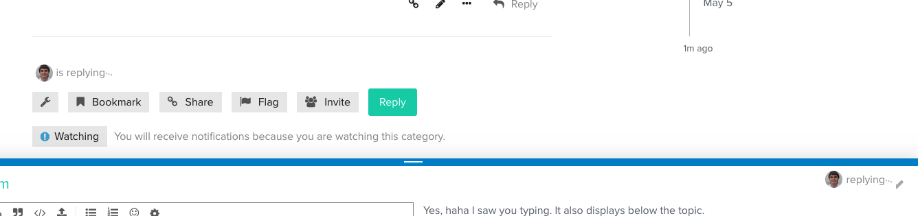
Oh, or maybe “is replying” text
Haha yes - I was being a bit off-topic myself  You can see someone typing and replying in the corner of your post.
Yeah, I also like it 
1 Like
All these modern technologies you know, “I am too old for this”
1 Like
At first when I saw your quick response and the message about real-time reaction it reminded me of all these jokes in chats that you are AI Like “see how fast I am, pretty cool huh”?)
Haha, you never know 
Solved the color issue  Closing the topic.
1 Like